The problem with springs and struts
You are no doubt familiar with autosizing masks – also known as the “springs and struts” model. The autosizing mask determines what happens to a view when its superview changes size. Does it have flexible or fixed margins (the struts), and what happens to its width and height (the springs)?
For example, with a flexible width the view will become proportionally wider if the superview also becomes wider. And with a fixed right margin, the view’s right edge will always stick to the superview’s right edge.
The autosizing system works well for simple cases, but it quickly breaks down when your layouts become more intricate. Let’s look at an example where springs and struts simply don’t cut it.
Open Xcode 5 and create a new iPhone project based on the Single View Application template. Call the app “StrutsProblem”:

Click on Main.storyboard to open it in Interface Builder. Before you do anything else, first disable Auto Layout for this storyboard. You do that in the File inspector, the first of the six tabs:
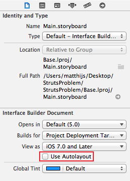
Uncheck the Use Autolayout box. Now the storyboard uses the old struts-and-springs model.
Note: Any new nib or storyboard files that you create with Xcode 4.5 or better will have Auto Layout activated by default. Because Auto Layout is an iOS 6-and-up feature only, if you want to use the latest Xcode to make apps that are compatible with iOS 5, you need to disable Auto Layout on any new nibs or storyboard files by unchecking the “Use Autolayout” checkbox.
Drag three new views onto the main view and line them up like this:

For clarity, give each view its own color so that you can see which is which.
Each view is inset 20 points from the window’s borders; the padding between the views is also 20 points. The bottom view is 280 points wide and the two views on top are both 130 points wide. All views are 254 points high.
Run the app on the iPhone Retina 4-inch simulator and rotate the simulator to landscape. That will make the app look like this, not quite what I had in mind:

Note: You can rotate the simulator using the Hardware\Rotate Left and Rotate Right menu options, or by holding down ⌘ on your keyboard and tapping the left or right arrow keys.
Instead, you want the app to look like this in landscape:

Obviously, the autosizing masks for all three views leave a little something to be desired. Change the autosizing settings for the top-left view to:

This makes the view stick to the top and left edges (but not the bottom and right edges), and resizes it both horizontally and vertically when the superview changes its size.
Similarly, change the autosizing settings for the top-right view:

And for the bottom view:

Run the app again and rotate to landscape. It should now almost look like this:

Close, but not quite. The padding between the views is not correct. Another way of looking at it is that the sizes of the views are not 100% right. The problem is that the autosizing masks tell the views to resize when the superview resizes, but there is no way to tell them by how much they should resize.
You can play with the autosizing masks – for example, change the flexible width and height settings (the “springs”) – but you won’t get it to look exactly right with a 20-point gap between the three views.
To solve this layout problem with the springs and struts method, unfortunately you will have to write some code.
UIKit sends several messages to your view controllers before, during and after rotating the user interface. You can intercept these messages to make changes to the layout of your UI. Typically you would override viewWillLayoutSubviews to change the frames of any views that need to be rearranged.
Before you can do that, you first have to make outlet properties to refer to the views to be arranged.
Switch to the Assistant Editor mode (middle button on the Editor toolset on the Xcode toolbar) and Ctrl-drag from each of the three views onto ViewController.m:

Connect the views to these three properties, respectively:
@property (weak, nonatomic) IBOutlet UIView *topLeftView;
@property (weak, nonatomic) IBOutlet UIView *topRightView;
@property (weak, nonatomic) IBOutlet UIView *bottomView;
Add the following code to ViewController.m:
- (void)viewWillLayoutSubviews
{
    if (UIInterfaceOrientationIsLandscape(self.interfaceOrientation))
    {
        CGRect rect = self.topLeftView.frame;
        rect.size.width = 254;
        rect.size.height = 130;
        self.topLeftView.frame = rect;

        rect = self.topRightView.frame;
        rect.origin.x = 294;
        rect.size.width = 254;
        rect.size.height = 130;
        self.topRightView.frame = rect;

        rect = self.bottomView.frame;
        rect.origin.y = 170;
        rect.size.width = 528;
        rect.size.height = 130;
        self.bottomView.frame = rect;
    }
    else
    {
        CGRect rect = self.topLeftView.frame;
        rect.size.width = 130;
        rect.size.height = 254;
        self.topLeftView.frame = rect;

        rect = self.topRightView.frame;
        rect.origin.x = 170;
        rect.size.width = 130;
        rect.size.height = 254;
        self.topRightView.frame = rect;

        rect = self.bottomView.frame;
        rect.origin.y = 295;
        rect.size.width = 280;
        rect.size.height = 254;
        self.bottomView.frame = rect;
    }
}
This callback occurs when the view controller is rotating to a new orientation. It looks at the orientation the view controller has rotated to and resizes the views appropriately – in this case with hardcoded offsets based on the known screen dimensions of the iPhone. This callback occurs within an animation block, so the changes in size will animate.
Don’t run the app just yet. First you have to restore the autosizing masks of all three views to the following, or the autosizing mechanism will clash with the positions and sizes you set on the views in viewWillLayoutSubviews:

That should do it. Run the app and flip to landscape. Now the views line up nicely. Flip back to portrait and verify that everything looks good there as well.
It works, but that was a lot of code you had to write for a layout that is pretty simple. Imagine the effort it takes for layouts that are truly complex, especially dynamic ones where the individual views change size, or the number of subviews isn’t fixed.
Now try running the app on the 3.5-inch simulator. Whoops. The positions and sizes of the views are wrong because the hardcoded coordinates in viewWillLayoutSubviews are based on the dimensions of the 4-inch phone (320×568 instead of 320×480). You could add another if-statement that checks the screen size and uses a different set of coordinates, but you can see that this approach is becoming unworkable quickly.
Note: Another approach you can take is to make separate nibs for the portrait and landscape orientations. When the device rotates you load the views from the other nib and swap out the existing ones. But this is still a lot of work and it adds the trouble of having to maintain two nibs instead of one. This approach is quite impractical when you’re using storyboards instead of nibs.
Auto Layout to the rescue!
You will now see how to accomplish this same effect with Auto Layout. First, remove viewWillLayoutSubviews from ViewController.m, because you’re going to do this without writing any code.
Select Main.storyboard and in the File inspector panel, check the Use Autolayout box to enable Auto Layout for this storyboard file:

Note: Auto Layout is always enabled for the entire nib or storyboard file. All the views inside that nib or storyboard will use Auto Layout if you check that box.
Run the app and rotate to landscape. It now looks like this:

Let’s put Auto Layout into action. Hold down the ⌘ key while you click on the two views on the top (the green and yellow ones), so that both are selected. From Xcode’s Editor menu, select Pin\Widths Equally:

Select the same two views again and choose Editor\Pin\Horizontal Spacing. (Even though the two views appear selected after you carry out the first Pin action, do note that they are in a special layout relationship display mode. So you do have to reselect the two views.)
The storyboard now looks like this:

The orange “T-bar” shaped things represent the constraints between the views. So far you added two constraints: an Equal Widths constraint on both views (represented by the bars with the equals signs) and a Horizontal Space constraint that sits between the two views. Constraints express relationships between views and they are the primary tool you use to build layouts using Auto Layout. It might look a bit scary, but it is actually quite straightforward once you learn what it all means.
To continue building the layout for this screen, perform the following steps. Each step adds more orange T-bars.
For the view on the left, choose from the Editor\Pin menu:
- Top Space to Superview
- Leading Space to Superview
For the view on the right, choose:
- Top Space to Superview
- Trailing Space to Superview
And for the big view at the bottom:
- Leading Space to Superview
- Trailing Space to Superview
- Bottom Space to Superview
You should now have the following constraints:

Notice that the T-bars are still orange. That means your layout is incomplete; Auto Layout does not have enough constraints to calculate the positions and sizes of the views. The solution is to add more constraints until they turn blue.
Hold down ⌘ and select all three views. From the Editor menu, choose Pin\Heights Equally.
Now select the top-left corner view and the bottom view (using ⌘ as before), and choose Editor\Pin\Vertical Spacing.
Interface Builder should show something like this:

The T-bars have become blue. Auto Layout now has enough information to calculate a valid layout. It looks a bit messy but that’s because the Equal Widths and Equal Heights constraints take up a lot of room.
Run the app and… voila, everything looks good again, all without writing a single line of code! It also doesn’t matter which simulator you run this on; the layout works fine on 3.5-inch as well as 4-inch devices.

Cool, but what exactly did you do here? Rather than requiring you to hard-code how big your views are and where they are positioned, Auto Layout lets you express how the views in your layout relate to each other.
You have put the following relationships – what is known as constraints – into the layout:
- The top-left and top-right views always have the same width (that was the first pin widths equally command).
- There is a 20-point horizontal padding between the top-left and top-right views (that was the pin horizontal spacing).
- All the views always have the same height (the pin heights equally command).
- There is a 20-point vertical padding between the two views on top and the one at the bottom (the pin vertical spacing).
- There is a 20-point margin between the views and the edges of the screen (the top, bottom, leading, and trailing space to superview constraints).
And that is enough to express to Auto Layout where it should place the views and how it should behave when the size of the screen changes.
You can see all your constraints in the Document Outline on the left. The section named Constraints was added when you enabled Auto Layout for the storyboard. (If you don’t see the outline pane, then click the arrow button at the bottom of the Interface Builder window.)
If you click on a constraint in the Document Outline, Interface Builder will highlight where it sits on the view by drawing a white outline around the constraint and adding a shadow to it so that it stands out:

Constraints are real objects (of class NSLayoutConstraint) and they also have attributes. For example, select the constraint that creates the padding between the two top views (it is named “Horizontal Space (20)” but be sure to pick the correct one) and then switch to the Attributes inspector. There you can change the size of the margin by editing the Constant field.

Set it to 100 and run the app again. Now the margin is a lot wider:

Auto Layout is a lot more expressive than springs and struts when it comes to describing the views in your apps. In the rest of this tutorial, you will learn all about constraints and how to apply them in Interface Builder to make different kinds of layouts.
How Auto Layout works
As you’ve seen in the test drive above, the basic tool in Auto Layout is the constraint. A constraint describes a geometric relationship between two views. For example, you might have a constraint that says:
“The right edge of label A is connected to the left edge of button B with 20 points of empty space between them.”
Auto Layout takes all of these constraints and does some mathematics to calculate the ideal positions and sizes of all your views. You no longer have to set the frames of your views yourself – Auto Layout does that for you, entirely based on the constraints you have set on those views.
Before Auto Layout, you always had to hard-code the frames of your views, either by placing them at specific coordinates in Interface Builder, by passing a rectangle into initWithFrame:, or by setting the view’s frame, bounds or centre properties.
For the app that you just made, you specifically set the frames to:

You also set autosizing masks on each of these views:

That is no longer how you should think of your screen designs. With Auto Layout, all you need to do is this:

The sizes and positions of the views are no longer important; only the constraints matter. Of course, when you drag a new button or label on to the canvas it will have a certain size and you will drop it at a certain position, but that is only a design aid that you use to tell Interface Builder where to put the constraints.
No comments:
Post a Comment